Monday 17 January 2011

Evaluation: Question One

In what ways does your media product use, develop or challenge forms and conventions of real media products?


  The media has its own different forms, codes and conventions to construct reality both in a positive outlook and negative. The codes and conventions are what allow the audience to recognise a genre and understand the storyline, because our genre was social realist drama we had to research into the typical codes and conventions used. In order to do this we had to analyse films that fall under this genre so we could identify the forms and codes used so we were knowledgeable when we came to produce our final products. This genre is very strict in how the characters are portrayed and it revolves around stereotyping and how society creates social class, we found that costume played a big part in this and that simple items of clothing such as a hoodie would create a very strong stereotype and status amongst the characters. We also found that all the films used conventions of drug use, gun crime and gangs and were filmed in urban areas usually in working class suburbs. Another convention that came to our attention was the majority of the filming and scenes that occurred at night or during the evening, this creates a sinister approach especially around the gangs and the idea of partying and youth. This is emphasised by the fast paced edit which creates a thrill and excitement for the audience, the fast pace and constant action surrounding the storyline creates drama and often a happy ending isn't the case.
  Within our group we all analysed our own choice of teaser trailers for primary research into the construction to give us an idea of the length a teaser should be and the amount of information shared, I think we challenged this last point by including much more of the storyline then most teasers do. However Adulthood and Kidulthood also did this, I there was not time for the characterisation of the characters in both of the teasers because of the fast edits and shot changes but I did have more information fed to me about the storyline then 500 Days Of Summer which left me with little if not no information to the actual plot. We wanted to challenge the structure of a teaser trailer and entice our audience by giving them a small introduction to our main character by trying to get our audience to relate to him. This was a brave move because we could be in danger of giving away too much information and our audience is left with no anticipation or excitement. The male protagonist was of importance and is a usual connotation of many genres. 'Steon' is caught up in a world of crime and drugs which has lead to rejection by society, with a lack of job he has no other way to pay for medicine needed for his sick girlfriend so the only way is through drug dealing. However this leads him into a life that he cannot escape. This type of character often has a depressive lifestyle that either the audience can relate to in their own ways or create the emotion of sympathy for him. Our trailer agrees with the stereotypical forms and conventions of a social realist drama by portraying the economic hardship that the characters have to face and the concept that they have no option but to turn to violence, gangs and drugs as a way to cope. I think it is important for the audience to know about the characters especially because of this being a fairly new genre with what I believe to have a much smaller target audience than that of a horror or comedy, one idea we had was that because the audience have this knowledge of the characters and the background it could be used as a promotional tool because unlike other films social realist dramas don’t always have well known actors so I think it is a harder market of genre. By doing this though it allows emphasises on the identity of the genre. The consumers watching our film will be familiar with Noel Clarke who was the director of ‘Adulthood’ their expectations will need to be matched which means constant reference to the reality of the lives portrayed, level of crime, drugs and the emphasise on the action throughout.

Breakdown of ancillary products:
 - Film poster: to advertise the product
 - Magazine front cover: to sell the product
 - Teaser trailer: to gain interest and audience's attention to the product

Film Poster:
Our film poster is effective and is recognisable in its genre, similar to 'Adulthood' and '4,3,2,1' we used colour tone to create tension and portray the hardship and reality of the lives of the characters in an almost depressing manner. It also gives off the impression of being in a city with the iron fencing and shabby effect with the grey tinting which is often a metaphor used to describe city life. We have taken into account the layout of typical film posters and the importance of mise en scene. The positioning of characters was important but also the location. We have placed our characters in order of importance, with the main character ‘Steon’ in the foreground and the muggers in the background. Here you have connotation of a group of males in hoodies and tracksuits which creates the stereotype of gang culture, or in this case the idea of the muggers following in the shadows close behind portraying the danger surrounding our main character. I have shown stereotypical symbols of teenage rebellion with the gun in Steon's hands close to his body, this is unseen by the audience at a first glance but is a strong symbol and represents the problem within teenage society and the controversial stereotypes surrounding them today. Adulthood has used a similar technique with the baseball bat lying on the ground; it is not what your eyes are first drawn to but still has a hard hitting effect and represents the danger and problems youth/teenagers face. It is clear from previous film posters that persuasion is a key technique used to gain audience interest, in Adulthood the director’s name is used as a promotion tool because he is instantly known for his work in this genre. We have used the conventional ideas of including directors, producers and key actors name on the poster and film company logos, this has finished off the film poster and kept it to a professional standard. 


Magazine Front Cover:
My research into magazine front covers taught me that it was a lot more effective to use a single front on shot of the main character usually a mid shot that filled the majority of the frame. This single image has to be powerful enough to promote the film which is why we have chosen an intimidating image of our main character, the directness and body language is powerful and the use of the gun is a convention of the genre. The colours we chose to use were to keep in with the lighting of the image as no to distract too much away from the image. From the magazine front covers I previously analysed I found colour theme was an important code. The types of articles tend to be based around other newly released films and often powerful vocabulary and adjectives such as 'amazing' are used as a promotional tool and to make the audience 'feel in the know'. We have achieved this by using 'latest' and cover stories that we feel would appeal to our audience. We decided that because of the specialised genre of our film it would feature in an independent magazine like Little White Lies, however we decided to use conventions of magazine like Empire and Total Film where they use large amounts of text overlapping the image unlike Little White Lies which is more creative and lets the image speak for itself.


Teaser Trailer:
As a group we watched Adulthood and analysed the conventions used in the teaser trailer, it was fast paced with lots of editing. Stereotyping plays a major role within the storylines of this genre, the types of clothing our characters wear and the make of them is very important because we needed to ensure we created a correct stereotype and social class. Adidas tracksuits, bodywarmers and hoodies we found were common clothing choices in Adulthood and props such as guns, money, drugs and weapons were featured throughout. Our title scene features three of these props as shown below and I believe confirms the genre straight away.


We created status amongst our characters through their clothing, for example 'Boss' wore a smart suit and was filmed in a nice car to create a sense of wealth and importance whereas the muggers and Steon wore casual tracksuits, hoodies and hats all in dark colours a connotation that they have something to hide. These items of clothings all represent a lower social class and the surroundings and locations we chose to film in emphasise this.
By using the props of fake guns and drugs, and nice cars you get this gang culture element and it allowed us to portray our characters and their status within the films without having to rely on just the types of clothing and the storyline to do this.


My primary research taught me how cross media campaigns work, the same fonts are usually used throughout all three products and similar imagery for both the film poster and magazine cover. We decided on our title font for 'Skrilla' because it is distorted and looks like grafiti. This font was then used on our film poster and magazine front cover to show continuity and we used the same tagline in each product. We used the same characters but chose not to use the same photos for the film poster and front cover because we found they both worked in different ways. I think this was a good choice because the image we used for the film magazine was intimidating similar to the image used for the Iron Man issue for Empire.


Overall from this project I have taken away with me skills in final cut and developed on my Photoshop skills. It has also helped me work both independently and within a group, I believe that our main product and ancillary task was a success and I am happy with the final outcome. I do however think there are areas in which we could have improved on, if we had managed our time better and been stricter on the deadlines we set ourselves. The ancillary projects and some aspects of the research would not have been as rushed if we had constructed our time better. I enjoyed the day of filming and even though that was fairly rushed too I am happy with how it came together. If we had the chance to redo the filming or spend more time on the editing we would have used a wider range of shots and variation in location to ensure it didn’t look like a short story and also to keep in with the convention of the fast pace and edited shots. We defiantly needed to communicate better as a group and perhaps even have made more time to do the filming in however I am fascinated by the positive feedback we got from both our target and accidental audience. I think in ways of promotion and cross media advertising we used the codes and conventions and have portrayed a deep understanding of advertising, production and new media and challenged the concept of a teaser by using it as a way of introduction to the character which we wanted to do so the audience could try and relate to him. I think as a group we understood which codes and conventions we needed to follow in order to ensure our genre was obvious. We have developed on these conventions throughout our media products and challenged forms of real media products.

Evaluation: Question Two


How effective is the combination of your main product and ancillary texts?

  From my previous research into Jennifer’s Body and the cross media campaign behind it, it gave me a solid understanding in how to use subtle similarities throughout each type of media to allow recognition in the product and how if done effectively enough the accidental audience will recognise it too. Through my research I found that by marketing the main character (Megan Fox) she becomes associated with the film and even though her character is portrayed in juxtaposed scenerios the audience are still able to recognise the film. When they used the film on the front cover of Fangoria magazine they did not need the same or similar image as that from the film poster because people were already aware of  her status alongside the film. This gave me a good understanding of the impact of cross media and how it works. The audience are able to recognise the product due to the similarites across the different areas of media they are advertised in. With this knowledge we decided the technique was to ensure the tagline and film title remained the same in each product and we used the same title font for both the film poster and magazine front cover. However we found that against our teaser trailer the distorted font did not work as effectively so chose a similar font that stood out instead.
(below is the link back to my post on cross media campaigns and Jennifers body as the example):


We choose a font that was bold but slightly edgy and fits in with the genre; there was no point in using creative or décor typography because that is not a convention of a social realist drama. From analysing the film poster for ‘Adulthood’ and ‘4,3,2,1’ we discovered that we didn’t need fancy font to catch the audience’s attention but that it was more important for our film title to stand out and attract attention just as much as the image needed to. Here is an example of previous film titles all of which follow similar font types yet are all recognisable to the audience. Adulthood and 1 Day both use their taglines as an essential to the promotion of the film which is what we also chose to do, however Adulthood used theirs in a different way to us by using it as a link to the previous sequel.

We followed the codes of the fonts for each of these film titles and as you can see from the screenshots above the placement and large, bold font creates an impact rather than disappearing behind the image. Especially for '4,3,2,1' the image works around the title and this is also the case for Adulthood were the title is placed above the characters. Here we have chosen to place the title further towards the bottom and in the centre between the characters, this was also used as a way to create distance between our main character and our muggers in the background.
We chose to use the same tagline in each product "£10,000, 1 WEEK" unlike Jennifer's Body who used the tagline 'She's evil..and not just high school evil' for the film poster whereas Fangoria played around with the actresses real name 'Megan Fox will eat you alive!' this challenged the conventions of the purpose of a tagline across cross media campaign but was still used as a promotional tool. I think by choosing to stick with the same tagline across all three products it prevented confusion and worked as an effective promotional tool.


Another convention we considered was the mise en scene and representation of the characters across each advertisement. We had to ensure that each character especially the main character was presented in the same way every time. When we came to shoot and produce our magazine front cover we were going to use the same image of the main character but in a mid shot, however when we looked back at our contact sheets we decided the image with the gun had a much harder and lasting effect. This was a risk we decided to take but from the feedback we got it seems to have worked. We didn't want to change the perception of our character but to just exagerate his character slightly by using a more aggressive and intimidating image similar to that used on Empire for the Iron Man issue. It also gave us a border around Steon so that we could include a lot of text. This image shows continuity from the film poster and teaser because of the recognition that this character has with the film.
http://gracereohorn.blogspot.com/2010/09/film-magazines.html
Overall I think our use of cross media has worked effectively, it is clear from the teaser trailer, the magazine front cover and the film poster who our main character is and the genre of our film. I have learnt that cross media although a more expensive option it is effective, the whole concept of advertising is selling your product and to do this the audience need to be aware of what you are selling, its purpose and what they can get out of it. This in the film industry is the entertainment, excitement or thrill they may get out of the film. By having a USP (unique selling point) such as a famous or well known actress/actor like Megan Fox in Jennifer's Body creates its own promotion. We tried to recreate this with a smilar scenerio on the front cover of our magazine, we used interviews and double page spreads of the main character as a promotional tool and selling point. Interviews with Noel Clarke and persuasive language sucj as 'exclusive' and 'latest' are appealing to the audience, we also chose to use articles that covered other storylines and recent films that may not be under social realist drama but similar genres.


Evaluation: Question Three

What have you learned from your audience feedback?

For our primary research into target audiences we created a questionnaire and sent it via Facebook users for them to fill in, this was effective because it targeted a larger audience and we could access information from a range of different audiences instead of limiting ourselves. This then helped us create our audience profile which I created and gave an example of (link to post). This questionnaire also gave us the information on what typical storylines audiences would be expecting and the conventions they associate this genre with. A typical answer to question that we got from our audience questionnaire was that gangs, violence and drug use was a typical convention and expectation within the storyline. Here is an example of a typical answer:


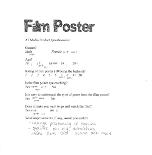
To get feedback on our media products we created a basic questionnaire which gave a rating on each of the products and whether or not our audience thought any improvements
 were needed. We handed the questionnaires out to 15 individuals both target and accidental audiences, this way we could gather the positive and negative responses to get an unbiased view on areas we could improve on and what aspects were a success. Overall the feedback we got was fairly positive and everyone recognised our genre through the codes and conventions we used within the main product and ancillary products which was the most important aspect.

http://gracereohorn.blogspot.com/2011/01/audience-feedback.html

Film Poster:
The film poster got rated highest between 7 and 8 out of 10. A lot of feedback was given on areas of improvement especially on the positioning of the tagline. The majority of our audiences said the tagline was too big and distracted them from the imagery and title. By repositioning it and shrinking it this may have worked more effectively and left the imagery to speak for itself more. However the problem we would then face if we chose to reposition the tagline is that we would have a large gap which would ruin the layout and rule of three within the frame. Instead we may have had to add in another character and we wanted the tagline to be against the iron fencing to create the impression of graffiti. Another comment made in an interview with Jenny was that she did not think the title 'Skrilla' stood out enough against the image, this was something we tried hard to work at because we wanted to create a similar effect to 1 Day with the distorted font however the problem we had was that it did not stand out against many of the background colours. I wouldn't change this though because I think the font is effective and important as a convention itself of the genre. Positive feedback around the layout and mise en scene of the poster was an occurrence in the questionnaires which means we successfully created a film poster that was recognisable in the genre through the clothing, props and lighting. Also the positioning of the characters was an important feature because I thought it was important to create a menacing approach by having the muggers in the background. This was picked up by Melody and Jenny who we interviewed for further feedback. Overall for the film poster the majority of people said it was finished to a professional standard and was eye catching, although it needed more information or hints to the storyline to maintain recognition and interest.

http://boos.audioboo.fm/attachments/999322/Recording.mp3?audio_clip_id=301363

Magazine Front Cover:
Again the feedback from our questionnaire was positive and similar to the suggestions on our film poster we have learnt that more experimental use of colour for typography would have achieved a more dramatic and purpose a more successful product as many of the audiences who gave feedback suggested that we should try using different fonts and colours for the cover stories and articles on the front page. Perhaps if we changed the white font with more vibrant colours or even experimented with outlining similar to our tagline on the film poster this would have worked more effectively. Looking back I agree with some of the comments made on the mast head because I think although we have developed it from our mock up to make it look more professional it is still lacking the excitement and appeal that the mast head of 'Empire' has. I am pleased with the final product and I think the drafting and development in our groups Photoshop skills from our first mock up has defiantly improved. We got a lot of praise on the articles we chose for the front cover and 5 out of the 15 individuals we asked rated our magazine cover 9 out of 10 which I am satisfied with. No one rated it lower then a 7.

 
Film Teaser Trailer:
The feedback we got from the teaser trailer I found was the most constructive because a lot of time was spent on this during the interviews and many of our audiences had varied opinions on what worked well and what needed to be improved on. Overall our film trailer got rated highest 8 out of 10 which shows that we successfully portrayed the genre through our use of mise en scene in the shots, edits, character stereotyping, prop and storyline. However the majority of the criticism we got were for amount of storyline we gave away, many of the comments made were that our teaser trailer was too similar to a short story rather then a teaser. If we had the chance to reconstruct our trailer I would agree and would probably have re-shot a few scenes and focused more on the edits and speeding up the shots to create that fast pace that is so apparent in Adulthood and Kidulthood. I am however proud of how we constructed our teaser against the music produced by Tim; it gave our trailer the sense of pace and did speed up the trailer slightly. Overall the majority of people said it was exciting and they understood the storyline and genre and I am pleased with the final outcome.
I think that these questionnaires have been constructive in the comments we have received and I am pleased with the outcomes. The interviews that me and Ellie conducted also gave us more in depth information we needed to see the range of views and whether or not the gender or age of the audience had an impact in their opinions. We had the issue that by taking the rick and using the gun and the intimidating shot of Steon on the magazine front cover some audiences may see us as glamorising gun crime when this is not what we are trying to achieve. However from the feedback we got back I don't think this misrepresentation was made and if anything we got positive feedback in the power that the image holds. If we had more time I may have suggested we try a similar experiment to '500 Days Of Summer' and 'Forgetting Sarah Marshall' were they produced three or four film posters and posted them virally on the internet for their audience to choose which one they preferred. This way you are actively getting your audience involved in the production and at the same time subconsciously making them aware of the product. It also remains anonymous and is an unbiased approach to not only promoting the film but also finalising the product. 

Evaluation: Question Four

How did you use new media technologies in the construction and research, planning and evaluation stages?

New media was used throughout my project and gave me knowledge of new ways to construct and research into the best possible ways of planning both independently and within my group.

Research Stage:
Firstly the main aim of my primary research was to understand the concept and roles that each media and advertisement played and the best way to approach this. I analysed a selection of film posters, teaser trailers and magazine front covers ranging in different genres to give me a sound understanding of the importance of mise en scene, layout and the codes and conventions I should follow. To access the teaser trailers I used Youtube which played a huge role within both my primary and secondary research. Two of our members within our group created YouTube accounts so that we could upload our audience feedback and finalised trailer which allowed us to then publish on to our blogs. It was also a way for us to send links out to our audience via facebook to help with feedback. Youtube allowed me to pause and replay the teaser trailers of other films over and over again so that I could thoroughly analyse the conventions they followed and understand the construction. I could compare how the different genres took on different approaches and when I came to do my further research I used it to watch Adulthood and compare the length of the teaser trailer to the finalised trailer and how the amount of storyline and approach differs.


Google and Google images was the main web search I used in finding further research into audience, film posters, film magazine and is what lead me to IMDB were I could access audience demographic breakdowns of films, trailers and added information. I also used this website for research into cross media campaign which was important for me to understand for when we came to produce our final products. I researched into other uses of new media and created a post of evaluation on each of the programmes I would be using further down the production schedule such as final cut, Photoshop and imovie. I got my information from Google again and any previous information or experience I had with these programmes. My questionnaire on target audience was sent out via Facebook because we thought this was the best way to target and get quick feedback because it is new media used daily by the typical audience we wanted to aim our product at. We did print off this questionnaire as handouts around college and another group member used GoogleMail although this wasn't as successful as Facebook.


Planning and Construction Stage:
At the planning and construction stage it was crucial that I used a wide use of new media because I needed to accommodate each area of planning with a specialised new media technology in order to develop on my ideas and the quality of my work.
One of the first things we had to do when we came to do the construction and planning was to create an animatic storyboard, this was done on Final Cut Pro. Ellie sketched our storyboard and the shot types we would be using and then we put them into a sequence alongside the music that Tim and his friend has produced using Logic Studio. By doing this at such an early stage we were able to refer back to it and develop on our ideas and as a group build on what we had and criticise areas that needed improvement. It gave us a basic idea of how our storyline would be constructed and when we printed off the storyboard we could use it for when we came to film so we had a plan that we could follow to prevent time waste.


We used a Sony HUR-V1E instead of the Sony A1E because of availability and also because we were recommended that it was a better camera. It had a wider dynamic range, better colour quality and also produced less noise which showed dramatically in the quality of our film and test shots. Because the majority of our filming was hand held we needed a better quality camera to ensure our filming was smooth, we did however use the tripod for the fight scene and more establishing shots. Before we started our shooting we had spent a few lessons filming test shots so we were comfortable with the camera and had an understanding of how to experiment with the exposure controls and how to change the set the white balance which we had to do by placing a white sheet of paper in front of the lens and manually adjust it. We had to adjust the focus ring to keep our shots in focus and lighting was a major issue especially because we did the majority of filming in the evening or late afternoon to keep in with the convention of our genre and the dark lighting to create the sinister approach we needed. I wasn't familiar with the Sony HUR-V1E and Sony A1E before this project however I now know the basic functions and enjoyed learning how to film and collaborate shots.
For our test shoots, contact sheets and ancillary tasks we used my Nikon D60, a high quality digital camera. The photos were of a high standard and it meant that when we came to Photoshop and edits the photos pixilation didn't occur because of the high resolution. Because of my knowledge of shutter speed and aperture we got some good shots and were able to follow the conventions of our genre. Both myself and two other members within our group have knowledge behind photography and are used to handling Nikons and Canons so positioning, rule of thirds and mise en scene was familiar to use which helped when we came to shoot and produce our ancillary products. As a group we came up with a shooting schedule which worked around both our own and our actor’s timetables, we had two different shots. One in the studio and one on location, here we chose a small alleyway next to the college which has low lighting and is surrounded by a housing estate. For this shoot Ellie was in charge and took photos on her Canon 450D and changed the ISO and shutter speed in order to prevent bleaching or unfocused and dark images. For the studio shoot I was in charge and used the soft box on the main character with a dark backdrop, I then set my shutter speed at 125 and my ISO to 400. Portrait and landscaped photos were taken on both shoots and were used as test shoots and contact sheets so we could see were if any improvements were needed.


We designed our film poster, magazine front cover and edited the majority of our images and fonts using Photoshop. It was probably the program I enjoyed working with the most because it allows you to be creative with the tools available; enhancing, cropping, trimming, and adding text. It allowed us to produce high quality work to a professional standard. Ellie worked on the film poster and we all had our own input. As a group we decided that our mock up was lacking in excitement and finally decided that the background/location wasn't working even after changing the hue and saturation levels. Ellie took photos of urban locations and used the selection tool to cut the characters from the previous location to a new landscape shot of iron fencing. This then allowed us to reposition the characters slightly and move Steon into the foreground more to emphasise his status within the film. This new background also gave use more room to work with on the placement of our film title, production and actors list, film logos and taglines.


We experimented with the title colour and decided that the red was too much of a distraction from the image, we still wanted our cast list to stand out but the main focus point needed to be on the image and the film title which we felt wasn't the case with this colour scheme. In the end we chose blue and white and used a outer glow to look like graffiti. We also experimented with the positioning of the cast list and decided they looked better above the film title and also allowed us to present the production team below spacing them out.


With the film magazine cover both me and Ellie produced our own basic mock ups were we focused on the layout and design rather then the article types. This allowed us to get together as a group and analyse the pros and cons. My previous research into film magazine taught me the extremes between Empire magazine and the large amount of text to Little White Lies which was more creative and imagery based. I also found an article in the Media Magazine which I scanned in and published on my blog, this gave an analysis on the importance of design layout and the techniques we should be looking at.
Photoshop was the programme we used for our magazine cover. We decided to challenge the convention of typical cross media campaign and used a different photography of our main character this time taking on a more intimidating role with the gun aimed towards to audience and his body language being far more tense. To get the dim and grey tint to the image we experimented with the levels and curves which gave more dimension to the image. It also created the idea of hardship and depression which is often portrayed in this genre and emphasised by the lighting used in both the film and the advertisment products.


Ellie experimented with a tool that I wasn't familiar with called radical blur, this gave the impression of movement surrounding the character and could also be used as emphasise on the action of the gun being fired or aimed towards the audience because it makes them feel uneasy which is what this tool achieves. The eraser was used to ensure the main character remained in focus whilst his surroundings distorted. By using layers we were able to achieve different levels of saturation and keep the main character sharp and in colour whilst the background was darkened with the black and white colour tool. When we were satisfied with our final image as a group the image was transferred to a new age and we started to create the magazine front cover around it by adding the mast head and articles. All of our fonts came from dafont.com because of the range of fonts and the easy access of transferring them from the internet to our work. We used the colour scheme of red and white which we experimented with on our film poster but chose against. It worked much better with the magazine cover because we wanted the cover to look busy and attract a wider audience; this was achieved by using a variety of articles and cover stories.


We used final cut pro to edit our filming on and because Tim has had more experience with this programme he was responsible for the main production whilst as a group we worked on the collaboration together. We selected the shots we wanted to use and sequenced them along the lower section of the programme, once we were satisfied with the sequencing and it followed close enough to our previously animated storyboard Tim dragged the music and fitted in alongside the shots so that the pace of the music was in time with each shot. We wanted to create excitement and thrill so the fast pace of the music was important. Timing was one of the most important aspects of our production so we spent a lot of time getting this right. Title cards were added were necessary for the tagline and the film title, if we had more time and had been quicker on deciding the font for our film title we would have also included this in our trailer so that there was continuity throughout however we used a similar font and it still worked well even if it was slightly basic. Transitions and edits were added and a theme of fading was significant throughout our trailer because it allowed smooth transitions through to each scene and was the most effective with keeping the shots in time with the soundtrack. We did use some edits to create discomfort for the audience and to enhance the action but the majority of the editing was dissolves and fading which are commonly used through the teaser for Adulthood too.
 

I took my fonts from dafont.com and used a series of font tests for both our film title and magazine title, this way I could compare the fonts together and test them on our final ancillary products using Photoshop CS3. The font we decided on for our film title was called 'distorted and scratch' and is similar to the font used in 1 Day. Dafont.com was easy to use and the fonts are already sectioned into genres and categories which was useful for when we came to do our font test.
http://gracereohorn.blogspot.com/2011/01/magazine-font-test.html
http://gracereohorn.blogspot.com/2010/11/possible-fonts.html


Paint was a much easier program to use compared to Photoshop for the more basic of tasks, I print screened and copied and pasted any images or screen shots I need and it allowed me to save all my work as a jpeg unlike Photshop were you have to convert the file into a jpeg yourself. Paint is a simple program with a much more simple layout and selection of tools to Photoshop which made it a nice easy program to work with.


Google search engine was my main source for pictures for our prop list, mock up plans and as a way of accessing sites to gather the information I needed for both research and planning.


Blogger was compulsory for this project and even though I wasn’t keen on this at first because I’m used to filing and doing more written work I actually enjoyed using my blog. It allowed me to keep my work organised and presented my work in a creative manner. However one down side to blogger/blogspot is when you come to write on your posts you don't get corrected on your spelling or grammer so to ensure my work was fluent and correct all my written work was written up on microsoft word document and copied and pasted onto my blog once it had been proof read.


Evaluation Stage:
For the evaluation stage we needed audience feedback on our products and we decided that because of the impact and media surrounding Facebook today especially the impact it has on the daily lives of teenagers that we would use it as part of our audience feedback. We used it for our research too and because of the success of this process we used it again for our product feedback. There are many ways we could use Facebook to our advantage, this was by sending out our questionnaires via wall posts, groups or over message, all of which we included a link to Youtube so they could access our teaser trailer.


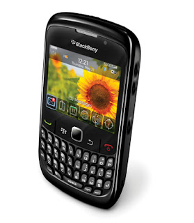
To gain more feedback we conducted a series of interviews using my Blackberry Curve 8250 and Ellie's LG Optimus One and recorded them. Ellie then set up an account on Audio Boo were we then transferred our recordings too, this then allowed us to copy the links to our blog for comparison and product feedback research.


Overall we used a range of new media techniques and have developed an understanding in which programs are most effective for each area of production. It has allowed us to use a variation of media and helped with the production of our work and prove that we can use of range of programmes to create professional products across different types of advertisement and media. As a group and individually we can identify which new media works in the research stage and what works best for planning, construction and evaluation. I am happy with the outcome of my coursework and the feedback we have been given, there are areas in which I would have improved on but overall I think our products were a success.

Wednesday 12 January 2011

Audience Feedback

We showed fifteen individuals both our target and accidental audience our main product, film poster and magazine front cover and asked them a series of questions to determine their thoughts and views on whether or not they thought our product was a success. This was to achieve a sound feedback and to help us understand were we could improve or use new ideas. We then also got 8 individuals to watch our film trailer and look at our main products whilst giving them a set of different, more indepth questions to look at and consider and then interviewed them to see what their thoughts and views were. Below our some examples of the questionnaires and interviews.


Me and Ellie conducted a series of interviews and recorded them on our phones as extra feedback. This gave us a more in depth view into what our audience thought about our media products and the genre we chose and whether or not we successfully portrayed this. Below are the audio recordings that Ellie uploaded on her account on audioboo:


From the feedback we got from the interviews I found Melody's (8th on the audio list) to be one of the most interesting because unlike the feedback we had collected from the questionnaires and other interviews she questioned our film poster and the lack of information given. At 0.25 she said she 'wasn't sure what it was about..whether it was a gang?' which gives us the impression that the genre is clear and that our poster has got her asking questions but it is not as clear as we perhaps thought. Greg was one of the interviewees that fits into our target audience profile and the feedback he gave us was positive with constructive criticism on the choice of colour on the magazine front cover and the positioning of our tagline on the film poster. Overall I am pleased with the feedback and believe we have used the codes and conventions successfully to gain the interest of our target audience and as some of the interviews show we have also targeted at an accidental audience too.

Tuesday 11 January 2011

Feedback Questionnaires

I created these feedback questionnaires for our audience to fill out so that we could get feedback on our final media products. We will be giving the questionnaires out to ten people, 5 whom fit our target audience profile and five who don't this way we can get feedback from both target and accidental.